

The right paint color can completely transform a room; giving it depth and setting the tone for the rest of the space. Painting the walls, cabinetry, trim, and doors can do wonders and make your home feel more customized and unique to you. Here at BANDD, we use a lot of different shades of blues in our designs because of the way that it brings a focal point to a space while still feeling classic and refined. We’ve rounded up some of our favorite blue paint colors that we’ve used in past projects!
Whirlpool – Sherwin Williams
A serene, beachy blue that brings a beautiful pop of color into any space that’s needing a little extra love. We used this paint color on the cabinetry in the primary bathroom for our Camelot New Build project and it made a notable statement without being too overpowering.

Photography by Molly Culver
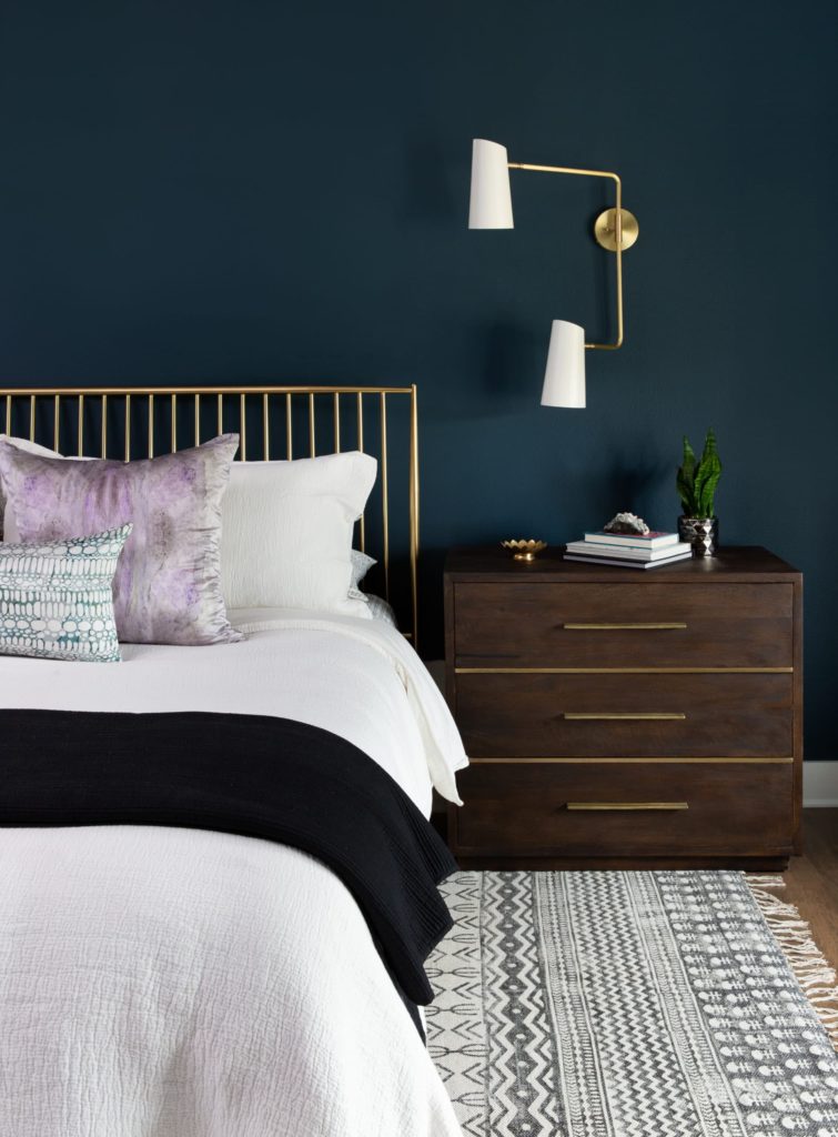
Cascades – Sherwin Williams
This one has to be my ultimate color crush. We’ve used this in all sorts of spaces; from kitchen cabinets to a bedroom accent wall. This paint color brings the perfect moody, rich, yet classic feel to a room. Just because Cascades is a deep teal, doesn’t mean that it will darken the room. We paired this paint color on the kitchen cabinetry in our Small Drive Remodel project alongside white oak and light tiles to create contrast and balance.
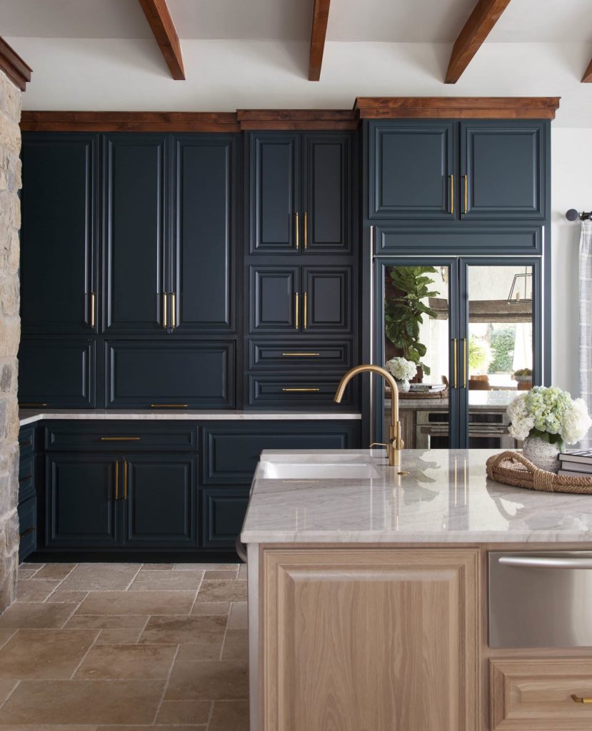
Photography by Ryann Ford
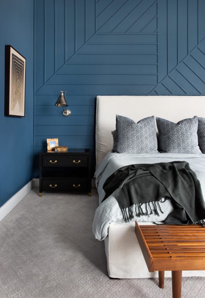
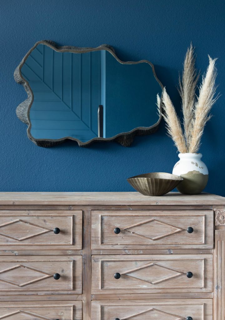
Hague Blue – Farrow & Ball
Hague Blue is another one of our go-to moody paint colors that still feels classic and fresh. I personally think that this color would look stunning in any space, from full walls to bathroom cabinetry. We used Hague Blue on the fireplace mantel in this Living Room Refresh, as well as throughout the walls in the primary bedroom in our Dreamcatcher Project.

Photography by Molly Culver

Photography by Madeleine Landry
Dignity Blue – Sherwin Williams
This shade is a great option if you’re looking for a darker blue that makes a statement and adds depth, without wanting to go too moody. We used this shade in the primary suite for our Chloes Bloom project and it provided the room with a light, fresh, and serene feel.
Photography by Molly Culver