Each year, Pantone announces their “color of the year” which is forecasted based off of the popular trends in all areas of design for that year. Back in December, Pantone chose Classic Blue, a timeless shade of azure, as the color of the year for 2020. For those of you who are familiar with our work, it’s pretty obvious that this beautiful, rich blue is one of our absolute favorites to use in our projects! This color is extremely versatile, as it works for practically any design style and can be used for creating a bolder, dramatic look, as well as a calming and tranquil feel. Here’s a little inspiration for how to incorporate this gorgeous, classic color into your space.
Subtle
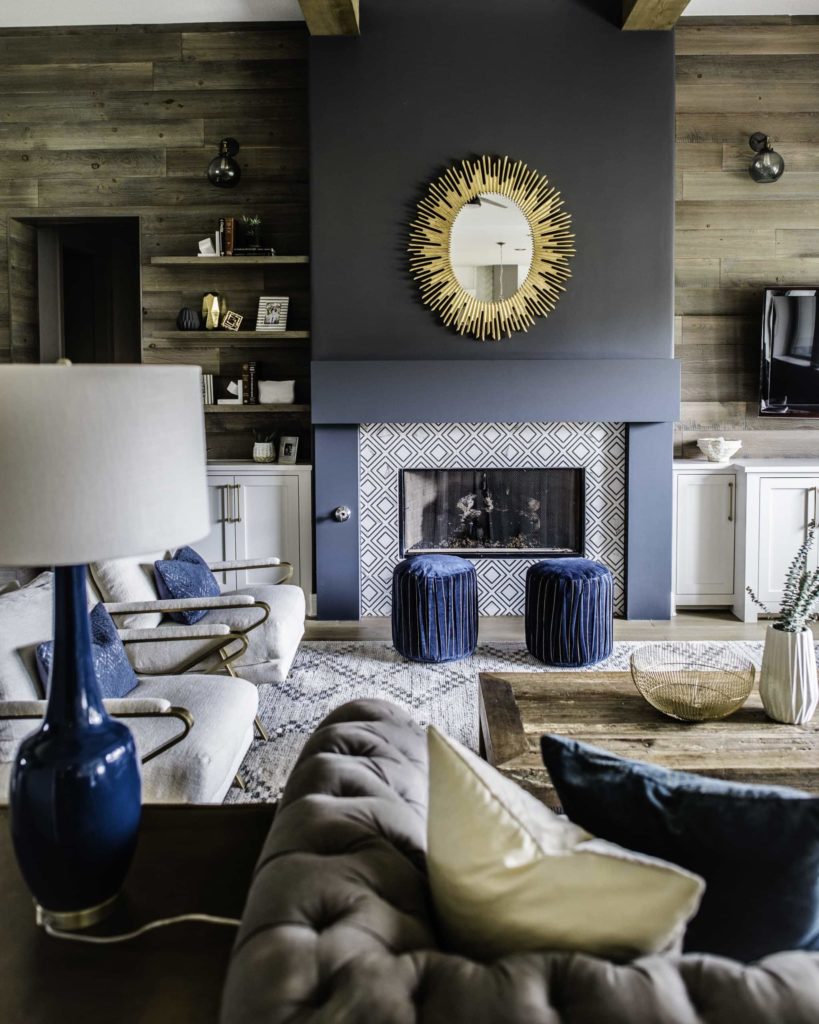
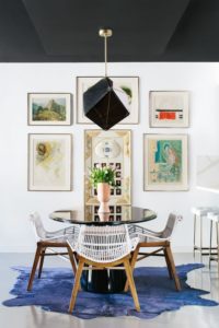
If you’re wanting to stay more subtle and just add in some pops of classic blue, this can be easily achieved through textiles and accessories. Throw pillows, blankets, rugs, and tiles, whether they’re solid or have hints of this shade, are perfect for bringing in a pop of this blue color. Also, you’re in luck! This shade of blue pairs really well with almost every color (when it’s done right!), but especially with grays, pinks, and other jewel-tones.

Design by BANDD Design | Photography by Molly Culver

Design by Eric Olsen | Photography by Karyn Millet

Design by BANDD Design | Photography by Katie Jameson

Design by Moore House Interiors | Photography by Grace Laird
Bold
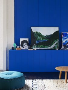
My favorite way to use this color is by making a statement or going all out with this palette! This color can ‘wow’ any space. If you want to use classic blue as a focal point or a statement piece, I recommend using it for larger pieces such as a sofa, accent chairs, bed, drapery, or area rug. You can also make a bold statement with this color through paint, such as on your cabinets, kitchen island, fireplace, and of course, walls. If you want to go all out with this color, you can achieve this by painting your walls or using wallpaper, combined with furniture or accessories all of the same color for a moody, monochromatic look.

Design by BANDD Design | Photography by Molly Culver

Design By Studio DB | Photography By Preston Schlebusch

Design by The Design Files | Photography by Eve Wilson

Design by BANDD Design | Photography by Madeleine Landry

Design by Black Lacquer Design | Photography by Mary Costa
