

It seems like monochromatic design is all the rage lately, with spaces dripping in skillfully harnessed tone-on-tone hues popping up left and right. Here at BANDD, we decided to put together a handy little 3-step guide on how to accomplish this look in your own home, without finding yourself living in an Yves Kleinian fever dream.
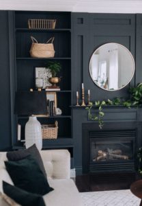
Image via Craftberry Bush
Step 1 – Go Back To Color Theory 101
When choosing a color to base your whole design around, consider not only how it makes you feel, but also what that hue does for a space. While it’s generally true that warm hues advance to the visual foreground while cool colors recede, there are definitely applications for both ends of the spectrum. If your space is on the smaller side and intended to be used as a soothing retreat, consider a more muted, cooler hue for its relaxing properties. On the other hand, for a vibrant and energizing effect, you might consider a warmer color.
This is also a good time to decide the intensity at which you’re willing to commit to the idea. If you’re just dipping your toe into the monochromatic pool for the first time and are fearful of creating an endless sea of aggressive orange, for example, consider a softer peach tone as a jumping off point. You can always build onto this as you feel more comfortable later on.

Design by Feasby & Bleeks | Photography by Ashley Capp
Step 2 – Revisit The Elements & Principles of Design, Too, For That Matter
Your best friends through this process are going to be the fundamental properties of contrast, line, pattern, and texture. In order to prevent a monotonous design that makes your space feel flat and one-dimensional, it is going to be imperative here that you incorporate a variety of different shapes, patterns, and tactile elements into the space.
Balance hard-lined forms with undulating, curved lines for a nice contrast. Juxtapose sleek finishes with different upholstery textures to create visual interest. Pair in patterns of different scale and solids in varying values. Don’t forget to utilize the different tints, shades, and tones of your selected hue. It’s all about the subtleties here.

Design by Bree Leech | Photography by Lisa Cohen
Step 3 – Finally, Break Up The Space With Metallics & Neutrals
In the world of design, metallics and neutrals don’t necessarily count as “colors,” but rather can work to add an extra polished element or breathe new life into your space. Don’t be afraid to tie in some silvers, golds, whites, and earth tones if you find yourself in a repetitive rut. Consider spicing things up with your hardware choices, lighting fixtures, and decorative elements, such as plants.
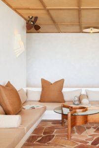
Image via House Beautiful | Photography by Nicole Franzen